Digipak planning and research

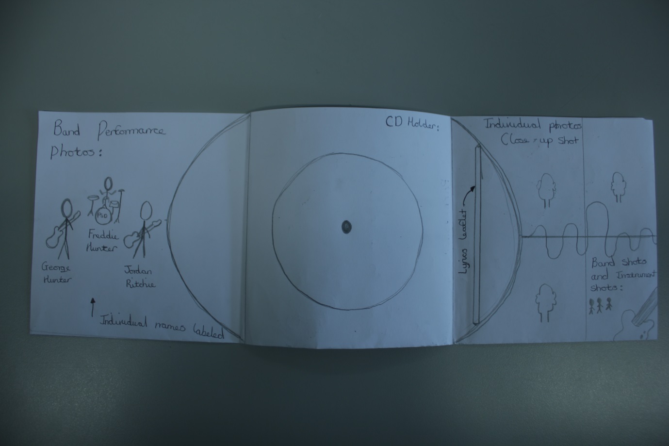
- In the picture above is the format in which digipak I would like to create. In both of the pockets labelled 'Inside' on the top right and left, I am thinking to have pictures displayed of either the band that are in the music video being 'Paper Shop Dave' or the actors.

- A prime example the format in which I want to do is Arctic Monkeys album 'Favourite Worst Nightmare'. The original template at the top of the post is 6 panels. This folds into the 3 folds out like the picture displayed above. I would want to place the CD holder in the middle with two leaflet holders either side. The folders will consist of leaflets that involve a brief on what is involved in the album. The other folder on digipaks usually contains something of different features to the consumer such as a Live DVD. I could design a folder for that to happen.
- On the back of the digipak is the track-listings. Below the track-listings will be the people who have worked on the album itself being producers, mixers and the artists themselves. With the track being wrote by Arctic Monkeys, they will be put on the back of the track explaining that they wrote the actual song for the music video. The performance in the music video will mean that the picture leaflet involved in a folder will be of Paper Shop Dave performing.

Full tracklisting for Arctic Monkeys’ AM:
- Do I Wanna Know?
- R U Mine?
- One For The Road
- Arabella - The track we are filming our music video to at number 4 on the album.
- I Want It All
- No. 1 Party Anthem
- Mad Sounds
- Fireside
- Why’d You Only Call Me When You’re High?
- Snap Out Of It
- Knee Socks
- I Wanna Be Yours
- The album artwork for Arctic Monkeys' new album 'AM' could also be involved on the digipak to inform consumers of what will be on the front of the album in case they heard the track and became interested in purchasing it.

'Paper Shop Dave' album artwork:

Too much information on display also hinders the appeal to the consumer in my eyes. I like the setup of bold and standout instead of writing everywhere and unnecessary speech.
- A great example of hand-drawn album artwork is 'The Beatles - Revolver'.
Several different photos of the individual members in the band are put together in a collage type format. This is what I wish to do on the left front side.


Paper Shop Dave logo:
The will be featured on the spine of the digipak, this idea is done on pretty much all CD's and digipaks.
Digipak Designs:
Digipak Foldout

Front cover
 Spine
Spine
- On the left of the front side shot, the page is dedicated to the band in images. A collage idea that I am going to be doing was inspired whilst I was researching and came across the popular 'Revolver' album artwork by The Beatles. The inspiration was based on the fact that my colour scheme is going to be black and white which is portraying the rock 'n' roll simple contrast and the fact I want it to look hand drawn, the 'Revolver' artwork is actually hand drawn also.

Back cover/Track-listings

Inside

Left-side flip out

Right-side flip out

- Example of a instrument shot below, close-up of the bass guitar input.

CD Holder

Lyrics Leaflet

Magazine advert research and planning:
Magazine
adverts are used by artists and bands to successfully broadcast themselves to an
interested audience. The magazine adverts that artists use are mainly
in music magazines, however can feature in other magazines such as 'OK!'. This is primarily because the audience will already be interested in music because they are reading a specific music magazine, and in some
cases that type of music is dependent on what genre related magazine they purchase.
Some examples of music magazines include: NME, Q, Rolling Stone, Mojo and Top
Of The Pops; specific genre related music magazines include: Kerrang which is rock genre
related, Vibe which is Urban and Hip Hop style music, Music which is a
classical based genre magazine and Billboard which is a pop music based
magazine.

NME AM 'The Final Chapter': This is another way in which bands can create their star image. Appearing on front covers of a popular magazine can boost the fan base and lead to more consumption of their music. It is a more direct way of advertising the latest news behind the artists because everyone who purchases this or even sees it will notice that it's the Arctic Monkeys. This is replacing the fact you'd have to already have the magazine and reading through it to see a magazine advert.

- The pose in which he is striking above the audience behind him also backs up my previous point. It is like he is a God to these people behind him who are screaming love towards him and he is just getting on with it like a standard day to day regime.
- Very large and bold writing of 'Arctic Monkeys' at the top of the image grabs the attention of anyone who would be interested followed by the less important stuff at the bottom in smaller font if someone was to take a closer look. I have always thought of this to be a sort of seduction technique, grabbing peoples attention and advertising where and when you could go and see them.
- Everything that you need to know is basically involved in this image; Support band (The Strypes) Tour dates, Ticket website/number, Date and time of tickets on sale.
- Also at the bottom, they have still been able to fit in a small advertisement for when the new album will be out to purchase and that the single 'Do I wanna know' is out now.
Image - The pose that Seasick Steve is doing represents his character very well. The mis en scene displayed isn't specifically for the shooting of the photo, it is the clothes that he wears on a day to day basis. The scruffy image is stereotypical of a person who has inherited it from a southern American state like Texas etc. The whole image is quite minimalistic.
Colour - Black and white colour contrast is a simple complexion which I think represents his music perfectly. The act is him with his guitar, a microphone and use of his foot as a metronome drum beat.
Text/font/size/colour -The text looks like it was drawn with a crayon. This is yet again a simple effect to the design of the magazine advert. Down to earth approach is done throughout this whole magazine advert. It is also used on the majority of his work, a sort of signature font.

The Prodigy Warriors Dance LIVE Album:
Image - This magazine advert also shows the point behind the album. The Prodigy are considered to be one of the best artists to see perform live. The quote from Kerrang using the word 'Ferocity' just sums them up perfectly. It appeals to me greatly as they are one of the bands that I haven't seen but really want to see. The crowd looking into the fire burst effect in the middle protects us from seeing the band on stage but also shows how manic it would be. A sort of comparison is there for the band towards the fire burst.
Colour - Vibrant colours are used. The fire effect draws you into what is actually happening on first impression. It describes the genre that they are, being Drum and bass perfectly.
Text/font/size/colour - The text used for 'The Prodigy' is quite a haunting, commonly used thriller font. This represents their stage presence perfectly. They tend to come on stage in weird, extravagant costumes with flashing lights and several other special effects. It isn't just a music based performance, they are a show of entertainment for their audience to witness. Not many artists plan and put together the amount that they do for their shows. The outfits however are often quite daunting which goes perfect with the jagged font they use.

Paul Simon:
Image - Paul Simon and his guitar. Establishing a relationship between the two, suggesting how much he loves music and his guitar. A sense of innocence portrayed in his facial expression and eyes, describing the genre well. His acoustic songs are very calming but incredibly catchy and melodic.
Colour - Basic scheme colours. Photo in black and white, sense of simplicity. Old fashioned quality to it. Portrays him as his character. Metallic gold type colour on the text, making it more stand out and bold to readers. Lighting is above him looking downwards to give a nice effect on the photo with shadows on the left side of his face with his arms coming over the black guitar into the light.
Text/font/size/colour - The font is very smart. Sophisticated, slim text. Size of the text on top of the page is clear. Bottom of the page text includes; Album name, magazine advert review quote, stating who is featuring and release date. This is actually a very humble approach to a magazine advert. It won't catch your eyes to another magazine advert like The Prodigy for example but can appeal to the elder generations that he used to play to in his song writing prime being the 60's-80's.

Magazine advert Mock-up:

The magazine advert design is taken quite simply from the front cover of my digipak. It is the design in which I drew up for my band a while back. From previous research, I have found out that more often than not, the magazine advert is usually the actual album front cover or something to do heavily with it.
I have inserted text boxes in the coffee stains (top right) with magazine reviews which I will make up when it comes to my final design edit.
No comments:
Post a Comment